
The mid-20th century was an exciting period in interior decoration history, reflecting profound shifts in society, technology, and culture. Following World War II, homes became centers of newfound optimism and innovation, shaped by practicality and the promise of modernity.
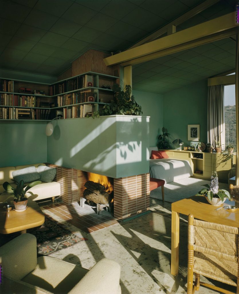
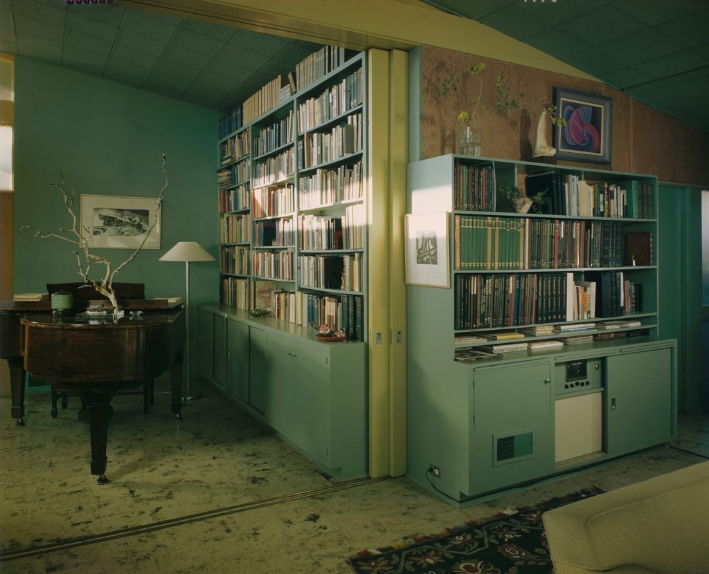
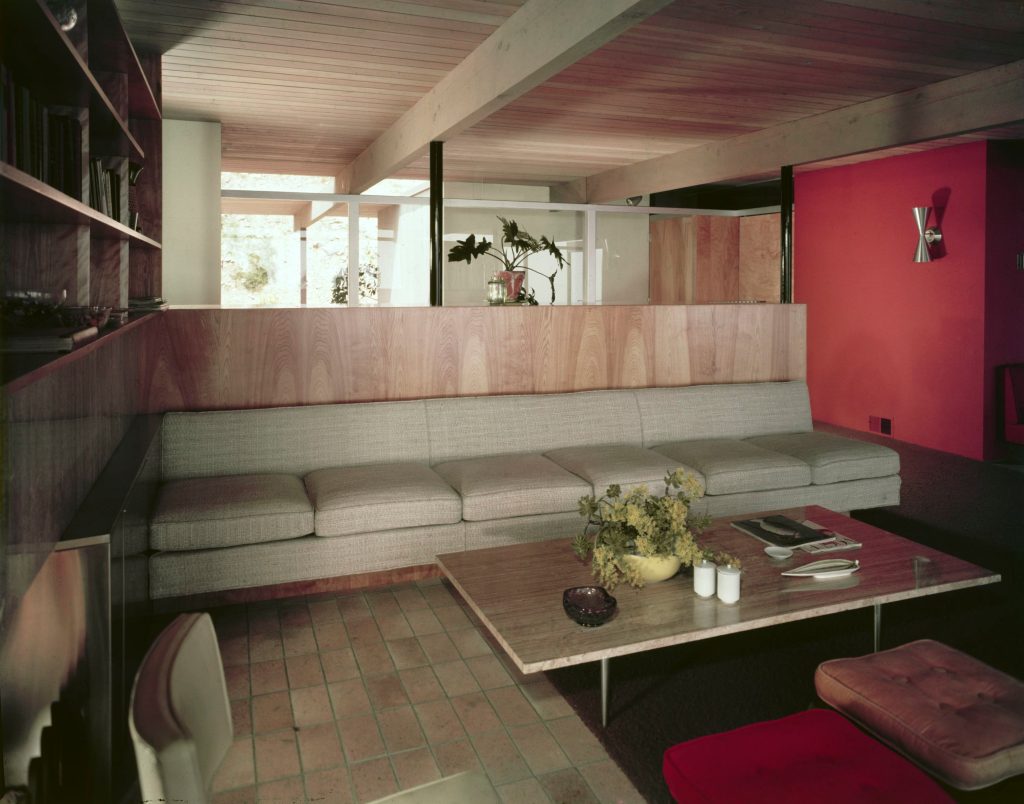
Interiors moved away from decorative styles towards simplicity, featuring clean lines and ergonomic forms that complemented carefully selected color schemes and natural materials.
Popular paint companies like Sherwin-Williams, Benjamin Moore, and Pittsburgh Paints played significant roles in shaping trends by offering palettes specifically designed to suit the tastes of these changing times.
1940s
In the 1940s, interior decoration was deeply influenced by wartime restrictions and the immediate post-war environment. Limited resources necessitated subdued yet welcoming palettes emphasizing calmness and reassurance.
Modest and practical colors, often promoted by paint companies through brochures and magazine ads, featured muted greens such as Sherwin-Williams’ “Jadeite” and soft blues like “Colonial Blue” from Pittsburgh Paints.
Creamy whites and earthy browns were also favorites. These hues were chosen for their calming effects, ideal during periods of uncertainty. Common color combinations featured soft greens and creamy whites, accented by rich browns or subtle blues paired with muted yellows. The prevalent materials of the era included hardwood floors, linoleum, and simple cotton textiles.
Popular Colors:
- Jadeite Green – A soft, muted green reminiscent of vintage kitchenware.
- Dusty Rose – A subdued, warm pink widely popular in mid-1940s interiors.
- Mustard Yellow – Rich, deep yellow commonly used in upholstery and accents.
- Slate Blue – Gentle blue-grey, found in tiles and textiles of the era.
- Dove Grey – Neutral, soothing grey often used as a versatile backdrop.
- Burnt Orange – Warm, earthy tone frequently featured in accessories and fabrics.
- Maroon – Deep burgundy that adds depth, widely used in furnishings and textiles.
- Creamy Ivory – Classic off-white, typical for walls, cabinetry, and appliances.
1950s
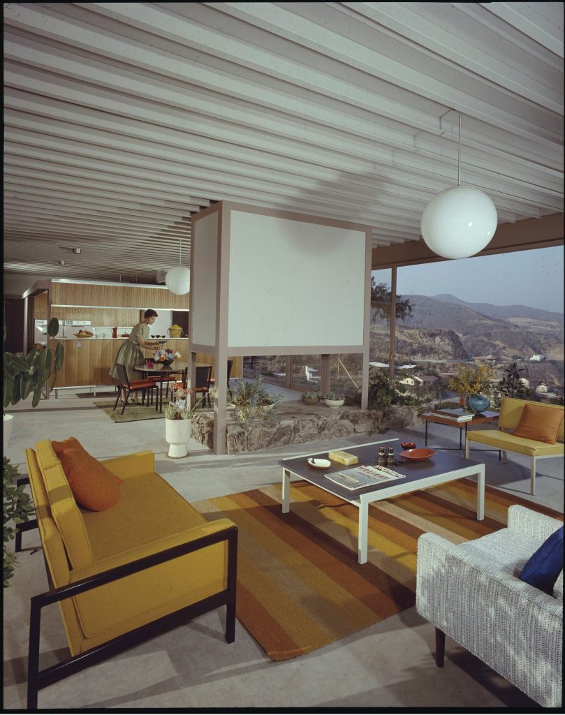
The 1950s brought a dramatic shift towards optimism and economic prosperity, clearly reflected in brighter and more cheerful interior palettes. Paint companies embraced this trend, introducing vibrant, playful colors that became synonymous with the decade’s spirit of innovation and modernity. Benjamin Moore’s “Flamingo Pink” and “Aqua Blue” or Sherwin-Williams’ popular “Harvest Gold” exemplified the era’s joyful aesthetic.
Interiors frequently combined contrasting colors like vibrant turquoise and pastel pink with chrome details, or fresh mint green with soft whites and light wooden accents. Technological advancements led to widespread adoption of synthetic materials such as Formica laminate countertops, chrome fixtures, and brightly colored vinyl upholstery, reflecting both function and style.
Popular Colors:
- Mamie Pink – Iconic pastel pink popularized by Mamie Eisenhower.
- Aqua Blue – Bright, fresh turquoise widely used in kitchen appliances and tile.
- Buttercup Yellow – Sunny, cheerful yellow found in kitchens and bathrooms.
- Mint Green – Soft pastel green, especially popular in bath fixtures and tiles.
- Coral – Warm, vibrant pink-orange common in textiles and accessories.
- Robin’s Egg Blue – Pale blue, frequently chosen for walls and enamel finishes.
- Dove Gray – Neutral, versatile backdrop color for walls and cabinetry.
- Harvest Gold – Rich, golden-yellow shade, gaining popularity towards the late ’50s.
1960s
By the 1960s, interior decoration took on new influences driven by broader cultural movements emphasizing environmental consciousness and a return to nature.
Paint colors transitioned into deeper, more organic tones. Olive greens, burnt oranges, mustard yellows, and rich browns were dominant choices, mirroring the counter-cultural movement’s values of authenticity and natural simplicity.
Popular paint shades included Sherwin-Williams’ “Avocado,” Benjamin Moore’s “Burnt Sienna,” and Pittsburgh Paints’ “Mustard Seed.” Typical interiors featured olive green paired harmoniously with burnt orange or mustard yellow, often accented with natural wood paneling and deep brown textiles.
The decade also embraced bold, psychedelic-inspired palettes featuring intense and eclectic combinations for more adventurous spaces. Materials such as wood paneling, textured fabrics, and shag carpeting provided warmth and depth.
Popular Colors:
- Avocado Green – Earthy, deep green iconic to kitchens and appliances of the era.
- Harvest Gold – Warm, bold gold popular in kitchen appliances, countertops, and tiles.
- Burnt Orange – Rich, intense orange frequently used in upholstery, curtains, and decor.
- Turquoise Blue – Vibrant, playful blue commonly found in bathrooms and decorative accents.
- Bright Sunshine Yellow – Bold and optimistic, often featured in furniture and accessories.
- Copper Brown – Earthy, metallic brown used in accents, fixtures, and appliances.
- Hot Pink – Bold, lively pink popular in fabrics and accessories reflecting the playful vibe of the 1960s.
- Chocolate Brown – Rich, neutral tone often chosen for furniture, flooring, and cabinetry.
Where To Buy
Now that you know what to look for, you need to find the right color on the shopshelf as well. We have conducted a research and below you can find some companies offering retro-inspired colors collections. Even though it is not an exhaustive list, it will offer you a start point:
1. Benjamin Moore
New Retro Palette: Celebrating the influential colors and design details of the ’50s, ’60s, and ’70s, this palette offers a modern twist on classic hues.
Eclectic Vintage Palette: This collection brings vintage home vibes to the 21st century with bold, period-inspired paint colors from the Historical Color Collection and Williamsburg® Color Collection
2. Sherwin-Williams
Color Through the Decades Series: offers authentic colors like Chartreuse, Radiant Lilac, and Holiday Turquoise, allowing homeowners to recreate the distinctive look of mid-century spaces.
Retro Revival Collection: This collection features contemporary colors organized with a mid-century sensibility, blending elements of Art Deco, 1950s suburban, and 1960s mod styles.
Eclectic Vintage Palette: This collection brings vintage home vibes to the 21st century with bold, period-inspired paint colors from the Historical Color Collection and Williamsburg® Color Collection.
Established in 1816, Old Village Paints specializes in authentic vintage colors. Their offerings include hues that align with the mid-century aesthetic, providing options for those seeking a traditional look.
4. California Paints
20th Century Colors of America Collection: developed in collaboration with Historic New England, this palette features authentic shades from 1895 to 1985, including the vibrant hues of the 1940s to 1960s. Each color has been researched and verified for authenticity, ensuring historically accurate options for your mid-century home renovation.
5. Behr
Retro Inspired Hues: Featuring earthy tones like olive green, mustard, burnt orange, and navy blue, this palette updates designs with a retro flair.
Do It Yourself
Taking on a DIY painting project to recreate the interior colors of the 1940s through the 1960s in your house? It’s not just about choosing the right shades—you’ll also need the right tools to get a clean, professional look. Here’s a handy list of essentials to get you started:
1. High-Quality Paint Brushes: Invest in a variety of brushes, including angled sash brushes for cutting in edges and trim, and flat brushes for larger surfaces. Quality brushes provide smoother application and reduce visible brushstrokes.
2. Paint Rollers and Covers: Utilize 9-inch rollers with appropriate nap lengths (3/8-inch is standard for smooth walls) to efficiently cover large areas. High-quality microfiber roller covers hold more paint and ensure an even finish.
3. Roller Extension Pole: An extension pole allows you to reach high walls and ceilings without a ladder, facilitating a more ergonomic painting process.
4. Painter’s Tape: Essential for achieving clean, sharp lines, painter’s tape protects adjacent surfaces and ensures a polished look.
5. Drop Cloths: Canvas or plastic drop cloths protect floors and furniture from paint splatters and spills, making cleanup easier.
6. Spackle and Putty Knife: Use spackle to fill in nail holes and minor wall imperfections. A putty knife ensures smooth application, resulting in a flawless surface ready for painting.
7. Sanding Tools: Sanding sponges or sandpaper (fine to medium grit) are necessary for smoothing patched areas and rough spots, ensuring optimal paint adhesion.
9. Ladder or Step Stool: A stable ladder or step stool provides safe access to higher areas, ensuring precision and safety during the painting process.
10. Cleaning Supplies: Keep rags or microfiber cloths handy for wiping up spills, cleaning surfaces before painting, and maintaining a tidy workspace.